Wait . . . I only need six things to make a great website? Is six the new magic “secret sauce” number for list posts or something? (Let’s not worry about that now.) In reality, you need more than six things to design and execute a website. For one, there’s all the techy stuff—the ones and zeros. What we’re interested in today, folks, are the six main ingredients that make potential customers actually want to browse your website: the six main ingredients that give your website the power to turn prospects into profitable customers. That’s a good website.
1. First Impression (a great one)
Have you ever landed on a website and had no clue what the company does? Believe it or not, these webpages are out there. And they’re not exactly lurking in the dark shadows.
A short while ago I found a homepage that featured a picture of pork chops searing over red-hot coals on an expensive-looking grill. The only text on the header is “The Taste You Dream Of.” Pretty picture, if you ask me. There is just one problem: When I look at the page, I have no clue what the company sells. Grills? Pork? The chops have so much seasoning on them that it looks like someone dredged them in a sandbox . . . Maybe the company is selling seasoning? As it turns out, the company sources different cuts of meat from “local farms” and assembles bundles—such as the grilling bundle—for people to buy. Neat idea.
Too bad I had to hunt and fish on the site to figure out who the company is, what they’re selling, and how it’s going to help me out.
Your Hero Section Should Answer Who, What, and How
We don’t get hung up on terminology at Lead Marketing & Design. When we say “hero section,” we’re talking about that portion of the screen you first see when you land on a company’s homepage. This portion of a website should tell someone:
- Who you are.
- What you sell, or what service you provide.
- How you can make your customers' lives better. (The success people can expect when they buy your product or service.)
If your hero section doesn’t accomplish this, you have a serious problem. It can mean the difference between someone continuing to browse your website and someone leaving your page to head on over to your competition. Most people decide within 10 seconds whether they’re going to stay on a page or head somewhere else. Here’s an example of a good header in action:
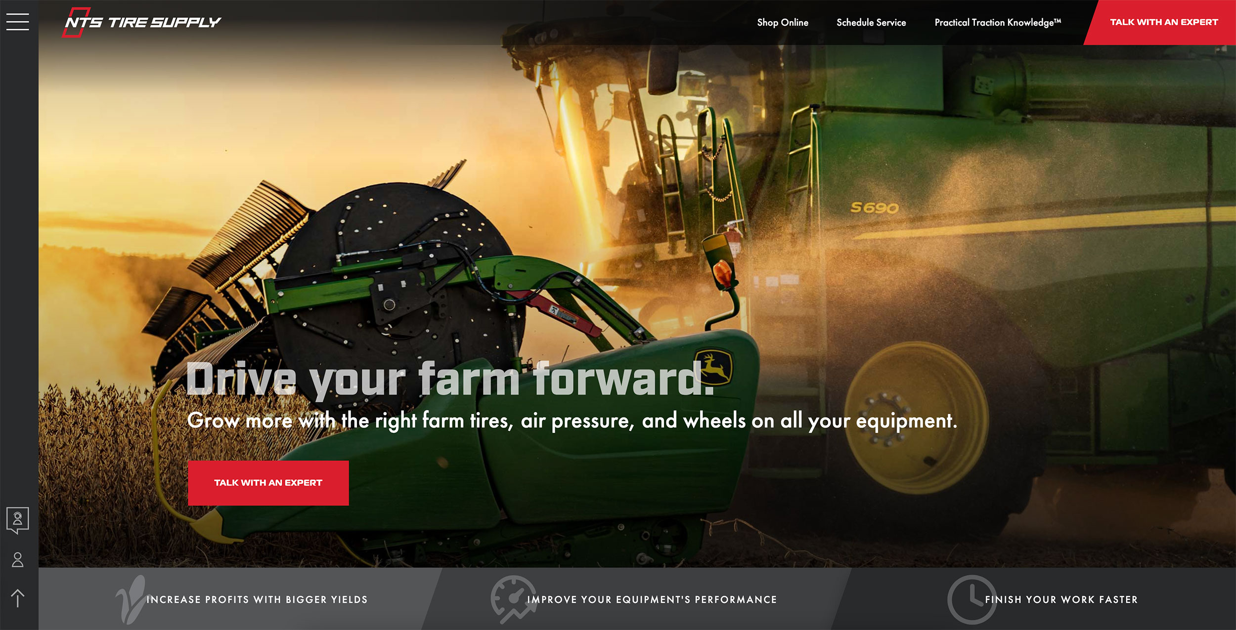
By looking at the first portion of NTS Tire Supply’s homepage, you learn that:
- The company is NTS Tire Supply (who).
- The company specializes in tires and wheels for farm equipment (what).
- You can “grow more” with the right tire and wheel setup (success).
You’ll also notice that NTS’s header isn’t cluttered with links to a dozen other pages. You can head to the online store, schedule service, check out the blog, or contact a tire expert. Concise and easy to follow.
2. Functional
A good website is a functional website. And vice versa. Here it’s easy to get deep into the weeds with technical details, but as a main concept, we can boil functionality down to a few main points:
Intuitive Roadmap
A good website is intuitive. I’m not talking about “unleashing the secrets of the golden ratio” or digging up golden keywords that will bring joy to the Google bots. On the simplest level, your website should make it easy for visitors to learn about your products and services.
First, you have to organize the website’s page structure in a logical manner. Products should be on the “products” page, etc. And the home page should give users a clear roadmap to access the rest of the site’s content. A few links at the top of the page are sufficient. Want to provide links to 10 different pages? You can, but where are people supposed to go? It’s best to send them in a clear direction. Too many roads lead to confusion.
Intuitive Content
Do you give people a clear, compelling reason to scroll down your home page? Is your content appropriate for someone who’s seeing your brand for the first time? Do you present your products and services as solutions for your customers’ problems? Do you provide enough information on your website? If someone would land on your site and meet your company for the first time, would he or she be 90% ready to book your services or buy your products after reading your website? The goal of your website’s content should be to facilitate buying. In order to accomplish this, your site’s content needs to be complete, clear, and appropriately branded.
If someone would land on your site and meet your company for the first time, would he or she be 90% ready to book your services or buy your products after reading your website?
At Lead Marketing, we’ve run into situations where a client feels the need to withhold information. This never helps increase leads. Want people to buy? Think of your company as a guide, not the hero of the story. Give people the information they need to make an informed decision and you’ll have a more functional website.
Legible
A well-designed website is easy to read. Headlines. Subheadlines. Body copy. Supporting images to complete the picture. It is entirely possible to provide a wealth of information on your webpage and make it easily scannable for those people who don’t have a lot of time or are just getting to know your company. Want a quick tip? Scan your website reading only the headings. (No paragraph reading allowed!) Do the headlines give you a basic idea of what you need to know? Is the flow of information logical with a clear message? If not, there’s work to do.
Mobile Ready
Be sure that your website builder optimizes your pages to perform on mobile devices. Any company that’s going to help you build a website should be able to make your website mobile friendly.
3. Finite
All good things must come to an end. Bad things too, for that matter. Once you have your lead-driving website up and running, it’s important to make sure that it stays current. You—or your marketing agency—needs to hold regular reviews of your site’s content. Does the site still accurately reflect what you have to offer? Are old products removed from your online store and new ones added in a timely manner? This is a vital part of your customer journey: what customers find on your website should reflect what they’ll find in the real world when they do business with your company.
4. Fast
This is another website requirement that you should quiz your marketing agency about. Will your website load and respond quickly? Will images still load in areas with sketchy internet access? (You’d think those would be far and few between in a modern post-industrial nation, but unfortunately that’s not the case.) An intuitive page structure and page layouts, as I mentioned above, will also improve the “speed” of your website and make it easy for people to move along down your sales funnel. And if your site includes an online store, it must be organized and searchable for the way most people shop for your products.
5. Forward Thinking
Yes, forward thinking has everything to do with anticipating the future. As in your customers’ future. Is your address, phone number, and e-mail accessible from every page? If you have a physical location, do you provide clear directions from your website? Do you have a contact form for people to submit information online? If you have a contact page, is it as appealing as the rest of your website? Oftentimes a website’s contact page winds up looking like something you’d expect the IRS to send you—not appealing or useful at all.
An Important Word on the Importance of Plans (customers love a good plan)
What next steps do you want people to take after they land on your website? You should present customers with a plan at each stage of their journey with your company. So, on your contact page, it’s helpful to provide a “plan” for customers. At Lead Marketing & Design, we usually like to see three-step plans on webpages:
- The first step is always “call us” or something similar. If you want someone’s business, ask for it!
- The second step should remind people what they’ll accomplish when they contact you. Book a vacation to one of several European destinations? Choose a new set of tires? Schedule a time to have an interior designer come over to formulate a plan to remodel your home? You get the idea.
- The third step should remind people of what success will look like once they’ve purchased your product or service. A home you’ll love. A vacation you’ll remember forever. Better fuel efficiency from those new tires. You get the idea . . . again.
6. Fotography
Spell check generally works at Lead Marketing, but “photography” would have ruined the whole F thing we have going on here. Plus, it’s foto, not photo, in plenty of languages around the globe. Anyway, have you ever surfed through a website crammed with stock photos? Or amateur shots that make your family Christmas photos look like candidates for an art museum in comparison? Professional branded photography makes a great first impression and is essential to holding customers’ interest as they navigate your website. In fact, photography is a central component of your brand identity. And consistent branding is one facet of your marketing plan that has the power to build trust with your audience. Why is this important? No trust. No sale.
Read more: Trust Prevents Your Brand from Becoming a Lemon
A Good Website is a Great Lead Generator
Most buyers today are 90% through the buying process before they even call you. Your website must:
- Feature the right information (it must sell!).
- Feature a logical page structure and well-organized content.
- Be fast-loading and responsive.
- Be current with no old products or information.
- Give customers an easy way to reach you.
- Provide customers with a plan (what’s going to happen next?).
Need a lead-generating website for your business? Give Lead Marketing & Design a call. We can help you refresh your current website to deliver more leads or create your company’s online brand presence from the ground up.


